You’re ecstatic about your new exterior paint color; it looked great on the swatch at the store. But it looks different in practice, in your home’s natural exterior light. In a few years, you’ll be right back where you started: repainting your home’s exterior, again. That’s why exterior paint color decisions should never be taken lightly.
Many painting contractors recommend testing samples at scale on the actual walls they’ll be going on. That’s because chip-based decisions can be unreliable due to how sunlight affects exterior paint color. Hold the swatches up against the corresponding wall to gauge how the color will actually read. One that reads correctly on a south-facing test patch can look entirely different on a north-facing wall in shadow. These decisions build off each other, so the order you make them determines whether the final scheme looks intentional or assembled.
Start With What You Can’t Paint Over
Every exterior has colors that stay regardless of paint. The roof, any brick or stone, masonry accents, concrete walks, and established landscaping are all fixed elements the scheme has to work around.
Roof Color, Brick, Stone, and Other Fixed Elements
The roof covers more visual real estate than most homeowners account for. A cool-toned roof, whether gray, blue-gray, charcoal, or black, is compatible with a wider range of body colors. A warm-toned roof in brown, tan, terra cotta, or weathered cedar narrows the compatible body color range toward warm neutrals, creams, and earth tones. Even if the individual colors look beautiful, a cooler blue-gray body will clash with a warm terra cotta roof.
Brick and stone come with their own considerations. Warm red-orange brick pushes back against cool gray or cool white body colors. Warm tan or buff stone works with creams, warm whites, and warm greens but fights stark cool gray.
The main appeal of brick is the texture it lends the facade, and matching brick’s color with paint flattens that texture. You need something that contrasts but coordinates with the brick. It cannot be the same color, but an exterior paint color with similar undertones is usually the right direction.
Exterior Paint Color Schemes: Body, Trim, and Accent
Once the fixed colors are mapped, the scheme builds outward in three decisions: body, then trim, then accent. Skipping ahead will lead to the same problems. Colors might look nice individually but not work as a set. Choosing the door color before the body and trim are settled is the most common version of that mistake.
Choosing the Body Color
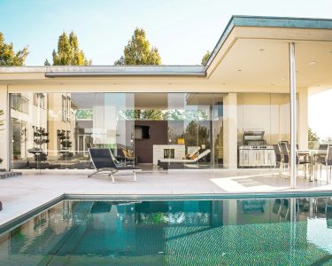
The body covers the largest surface area and sets the dominant tone. Light body colors make a house read as larger and photograph better across varying light conditions. Dark body colors recede visually, which can be an advantage on a large house where you might want to reduce apparent mass.
Saturated colors consistently look darker at full scale than they do on a chip, sometimes by a significant margin. Always test a large sample on the actual wall in natural daylight for saturated or deep choices.
What Trim Color Actually Does
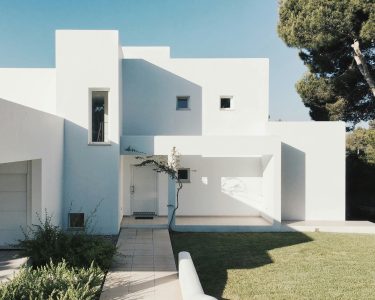
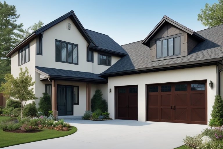
Trim frames windows, doors, corners, and rooflines. The contrast between body and trim controls how far the facade’s architecture projects. High contrast, such as white trim on a dark body or near-black trim on a light body, emphasizes every architectural line.
That emphasis works in your favor on well-proportioned homes with good symmetry. Homes without those advantages cannot leverage high contrast as well. If a home has awkward proportions or irregular window placement, high contrast draws attention to those problems. Lower contrast is usually a better choice for these homes. It unifies the facade and reads more quietly, which is often the better choice for houses where the architecture is not a strong asset.
Semi-gloss on trim is standard because it resists moisture better than flat or eggshell and holds up to handling around windows and doors.
The exterior wood painting on fascia boards, window casings, and porch columns often calls for a different product. Wood absorbs and expands differently than fiber cement or vinyl, and the finish choice affects how long the trim color holds before it needs refreshing.
Using exterior design features as accents intentionally, treating moldings, brackets, or belly bands as a distinct color zone rather than defaulting them to the trim color, is what separates a coordinated paint job from one that just has multiple colors on it.
Accent Colors: Doors, Shutters, and Architectural Details
The accent covers the smallest surface area but has the highest visual impact. The clearest example of accent color is the front door. It is also the easiest to change later if you do not like how it looks. That makes it a reasonable place to take a risk you would not take with the body or trim.
Shutters should coordinate with either the trim or the accent. A scheme with a body, a trim, an accent door, and shutters in a fourth unrelated color reads as unresolved. Matching shutters to the trim reads cleanly. Matching them to the door or accent creates stronger visual bracketing around the windows.
Contrast between the accent and the body drives the visual effect. An accent color that is too close to the body color will not project well across distance. The door reads as an accent because it is clearly different from everything around it. That effect vanishes without enough contrast.
Exterior Paint Color Schemes for Common Architectural Styles
Not every color combination works on every house. The massing, proportion, and detail level of different architectural styles respond differently to color saturation and contrast.
Traditional, Colonial, and Cape Cod Homes
Traditional, colonial, and Cape Cod styles share a characteristic that makes them relatively forgiving: symmetry and regular proportions that support high-contrast trim without exposing awkward geometry. White or off-white trim against a deeper body color is one of the most durable exterior paint color schemes for these styles. Deep body colors like navy, deep green, deep red, and dark gray read as appropriately serious on formal traditional styles. Saturated brights tend to fight the architectural character.
Craftsman homes work differently. The style celebrates structural honesty through exposed rafter tails, tapered columns, and detailed brackets. Earth tones were historically standard for good reason. Using two or even three trim colors to highlight structural elements is appropriate to the style in a way that would not work on a colonial.
Ranch homes present a specific challenge. The low horizontal profile means heavy or dark body colors can make the roofline feel like it is pressing down on the house. Light to medium body colors that work with the horizontal lines tend to read better. Deep body colors work on ranches with strong vertical elements but benefit from a lighter trim color that lifts the visual weight.
Mistakes That Make Exterior Color Schemes Fall Apart
Choosing the body color before accounting for the roof is the single most common mistake. The roof undertone either supports or fights the body color. Discovering a conflict after painting the home requires a full repaint to fix.
The harsh artificial light in most paint or home improvement stores is not representative of the natural light your home appears under. Colors that look right in the store may read differently in direct sunlight, open shade, or shadow, and the reverse is equally true. That is why you should always test the exterior paint color you like on the actual surface under multiple lighting conditions.
Trying to match brick or stone exactly almost never looks good. Attempting to mimic masonry tends to look muddy, not harmonious. Coordinate these tones, but there still needs to be some contrast between them.
Using too many unrelated colors creates visual noise. The connecting thread in a well-built color scheme is usually a shared undertone or a consistent value relationship.
Some color limitations are structural and have nothing to do with the paint itself. Exterior renovation ideas that change the material or profile of the facade can open up color options that were not available before.
An experienced painter will flag most of these problems during a pre-project consultation. Bringing a settled scheme to exterior house painters who can review the fixed colors on-site before any product is purchased can prevent the most expensive mistakes.
Exterior Paint Color Schemes: Getting the Order Right
Fixed colors first, body second, trim third, accent last. Done in the wrong order, the decisions compound quickly and usually end the same way: the accent is chosen first, the body comes next, and the roof conflict is only discovered after the purchase is committed. The exterior paint color schemes that hold up are built in sequence, with each choice tested at scale on the actual surface before locking in the next.
Frequently Asked Questions
How many colors should an exterior color scheme have?
Most exterior schemes use three: body, trim, and accent. Four is workable on complex facades with many material zones or strong architectural detail. Two can work on simple facades where the goal is a quiet, unified appearance. More than four almost always creates visual noise unless there is a clear architectural reason for each extra color zone.
How do I test exterior paint colors before painting?
Paint manufacturer samples formulated for interior use should not go directly on exterior siding; they are not rated for weather or UV exposure. Benjamin Moore recommends applying samples to large white foam core boards instead, which can be moved around the exterior to test the color against the actual siding in different orientations. Apply two coats to the board and let it dry fully before evaluating. Then observe the color in direct sun, in open shade, on a north-facing wall where light is indirect, and at different times of day. A sample that holds up consistently across those conditions is a reliable choice. One that looks right in one condition but shifts noticeably in another is something you should pay attention to before committing.
Can you repaint just the front door without repainting everything else?
Yes. Accent colors, including the front door, can be updated independently without repainting the body or trim. It is the most cost-effective way to refresh an exterior scheme. The constraint is that the new door color still needs to work with the existing body and trim. Changing the door to something that fights the trim creates the same mismatch problem in reverse.